Reconsidering Irish fatalities in the First World War
The relationship between Ireland and the First World War is a fascinating one. New angles and discoveries continue to emerge, and it seems that hardly a month goes by without a new article in the Irish Times that contains content on the Great War.
Naturally, the centenary of that conflict is a major reason for the re-assessment of Ireland’s role in the war, but for someone who has studied this relationship for the past decade the abundance of new information is heartening.
Of course, there are a few points of fact that remain an issue, namely the precise number of men who served and the number who died in the war. Several local historians have chipped away at the latter issue, usually on an individual county level, but as far as readily available statistics on Irish fatalities in the First World War, Patrick J. Casey’s “Irish casualties in the first world war” from the Irish Sword (1997) is still the go-to reference, at least until all the emerging research is aggregated.
It’s no secret that the memory of the First World War was used for different purposes in various corners of Ireland.
I’ve used Casey’s article quite a bit over the years, but I’ve usually taken it at face value. What I hope to do here is to offer some additional analysis on the numbers that Casey bore out in his article.
It’s no secret that the memory of the First World War was used for different purposes in various corners of Ireland. It may be a bit reductive, but at its core the mythology surrounding Irish service in the British Army became a shortcut that informed who died for their country and how.
For many Northern unionists, the beating of the war drum in 1914 demonstrated unionist resolve and commitment to the United Kingdom. This mythology became a cornerstone of loyalist ideology in The Troubles, and associated imagery can still be seen in the murals of the Shankill Road in Belfast today.
Unionists mythologised the sacrifices of the First World War while nationalists tried to forget them. Who really sacrificed more?
In the Free State-turned-Republic, the First World War was basically an historical footnote. Something that people knew happened, but passed over it unless they were truly interested in the subject.
After dealing with issues surrounding these ideas for years I wanted to find a way to test these myths. Was it possible to determine if one section of the Irish population was really better at dying for their country in the First World War?
In a nod to T. W. Moody and R. D. Edwards and their commitment to “value-free” history, I wanted to see what would happen if human logic and passion was removed from the analysis. Therefore, I opted to do a basic statistical analysis of the number of Irish fatalities, as presented in Casey’s article, in an attempt to answer this central question.
Casey presents his data in a table that cross-tabulates county of origin with regiment of service. Now Casey’s list of regiments is extensive, but the majority of Irishmen who fought in the war did so in an Irish regiment. There were nine Irish regiments:
- The Connaught Rangers
- The Irish Guards
- The Prince of Wales Leinster Regiment
- The Royal Dublin Fusiliers
- The Royal Inniskilling Fusiliers
- The Royal Irish Fusiliers
- The Royal Irish Regiment
- The Royal Irish Rifles
- The Royal Munster Fusiliers
Recruitment
(Please click on the maps below to enlarge them)
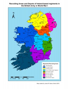
The map below details the recruiting areas for each regiment as well as their respective recruiting depots. (Note that the Irish Guards was the only regiment that technically recruited from all thirty-two counties. Since it functioned as a catchall the other eight regiments are highlighted here.)
Originally, the analysis I performed focused on these nine regiments and considered whether one’s county of origin or service regiment made a difference among the war dead.
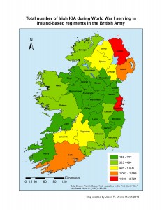
Dublin and Antrim were the two leading sources of recruits.
I then took this same approach that I used for all thirty-two counties and applied it to each of the four traditional Irish provinces, Ulster, Leinster, Connaught, and Munster, as well as an additional test on the six counties that would eventually comprise Northern Ireland. (I realize that using the term Northern Ireland in this period is anachronistic, but it is a useful analytical lens because of post-war myth-making.)
For brevity’s sake I’ve only present the final results. If anyone is interested in the nitty-gritty details of how this analysis was done feel free to contact me.
The central assumption throughout out this process is that most men likely joined the army in the same county cited as their county of origin. Recruiting data by county is extremely elusive, as most of those records were destroyed in the Four Courts fire in 1922. Ideally, it’d be preferable to pit enlistment rates against the total population and number of Killed in Action (KIA), but that data simply doesn’t exist.
So with this lengthy preamble for context, what were the results of this analysis?
 When comparing county of origin with regiment of service for the entire island the analysis stated that regiment did not matter. The fact that most Irish volunteers served in Irish regiments likely accounts for this fact.
However, in the county analysis several stood out among the rest. Antrim was in a group all on its own at the top of the list. After Antrim, the counties of Dublin, Down, Cork, Londonderry, Armagh, Tyrone, and Tipperary constituted the next group. The third classification category included the other twenty-four counties.
So if you served in the First World War being from any of the counties listed could have a negative effect on your likelihood of survival, especially for those from Antrim. This finding isn’t really surprising, as counties with a higher population had more men to contribute to the war effort, and therefore potentially higher aggregate KIA numbers.
Interestingly, when getting to a more granular provincial level, Antrim was no longer an outlier in either the nine Ulster counties or the six of Northern Ireland. Dublin, however, remained an outlier in Leinster. County of origin wasn’t statistically relevant for the counties in the other two provinces.
Regiment may not have mattered at the island level, but at the provincial level it made a difference. This shouldn’t come as a major surprise, considering the recruiting areas of some regiments.
Casualties
(See the appendix below for the total Irish casualty figures per county)
In the analyses of the Ulster and Northern Ireland counties regiment came back as statistically relevant, but after running further tests it was determined that the likelihood of dying in any of the regiments was essentially the same.
Service regiment was also a relevant indictor for Munster and Connaught. For the former, predictably, the Royal Munster Fusiliers was the worst regiment to serve in in terms of KIA.
The next two worst regiments were the Royal Irish Regiment and the Irish Guards, followed by a grouping of the remaining six regiments. In Connaught, the Connaught Rangers was the worst regiment to serve in, but there was no statistical difference amongst the other eight regiments.
Not all regiments saw the same type of combat action, and when and where regiments served likely impacted the number of fatalities associated with that regiment. Unfortunately, that data is not readily available at this time (as far as I know).
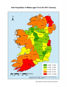
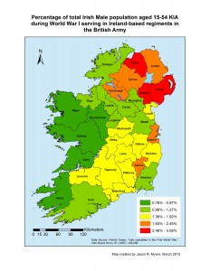 Perhaps the most telling result from all these tests is the proportion of Irish KIA to total male population aged 15-54 in Ireland. There is no statistically significant relationship between this ratio and county of origin. Across the entire island the range of the population-to-KIA ratio is only 2.33.
The average proportion for all thirty-two counties was 1.66%. Antrim (which is home to most of Belfast) and County Dublin, with its eponymous principal city, would seem safe bets for having the highest ratio of KIA; both shared a similar ratio of 2.45%. The distinction of highest ratio of KIA to male population went to County Down at 3.09%.
The distribution of casualties is broadly in line with that of the male population of military age.
This analysis is perhaps the most telling in my estimation. While the raw number of fatalities vary widely from one county to the next, there is far less disparity between KIA-to-population ratios. These results then beg the question: does it make sense for any group to mythologize the sacrifices made by Irishmen during the First World War?
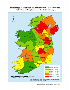 It’s difficult to conclusively state that in light of this analysis that one section of Ireland gave drastically more for the war effort than another.
Considering that both sides of the Home Rule question used enlistments in the First World War to justify their position for or against Home Rule then dying for that cause demonstrates the ultimate commitment to it, as morbid as that sounds.
Of course, we can enter the typical caveats that not everyone who enlisted did so for political reasons, but the myth factory never concerned itself with that point. Statistically the data suggests that the differences in terms of lives lost during the war between the various areas of Ireland do not warrant the mythologizing that those men’s sacrifices generated.
Does it make sense for any group to mythologize the sacrifices made by Irishmen during the First World War?
In the absence of additional data that can either corroborate or disprove whatever narratives have been constructed over the course of the past century historians will have to continue to make educated guesses, like this one.
Jason Myers is the author of The Great War in Irish Memory and Culture, 1918-2010.
Appendix I – Irish First World War Deaths by County
| County | Total Male Population, aged 15-54 (1911) | Total Irish KIA | Ratio of KIA in all regiments to 1911 Total Male Population, 15-54 | Irish KIA serving in Irish Regiments | Pct of Total KIA serving in Irish Regiments | Ratio of KIA in Irish regiments to total Male pop, 15-54 |
| Antrim | 151,838 | 5,122 | 3.37% | 3,724 | 72.71% | 2.45% |
| Armagh | 30,135 | 1,128 | 3.74% | 845 | 74.91% | 2.80% |
| Carlow | 10,289 | 333 | 3.24% | 245 | 73.57% | 2.38% |
| Cavan | 24,980 | 431 | 1.73% | 322 | 74.71% | 1.29% |
| Clare | 28,405 | 360 | 1.27% | 267 | 74.17% | 0.94% |
| Cork | 110,609 | 2,226 | 2.01% | 1,383 | 62.13% | 1.25% |
| Donegal | 42,084 | 720 | 1.71% | 494 | 68.61% | 1.17% |
| Down | 51,703 | 2,056 | 3.98% | 1,599 | 77.77% | 3.09% |
| Dublin | 134,845 | 4,973 | 3.69% | 3,307 | 66.50% | 2.45% |
| Fermanagh | 16,452 | 510 | 3.10% | 396 | 77.65% | 2.41% |
| Galway | 48,374 | 683 | 1.41% | 468 | 68.52% | 0.97% |
| Kerry | 41,845 | 443 | 1.06% | 318 | 71.78% | 0.76% |
| Kildare | 23,764 | 567 | 2.39% | 383 | 67.55% | 1.61% |
| Kilkenny | 21,099 | 475 | 2.25% | 355 | 74.74% | 1.68% |
| Leitrim | 13,494 | 222 | 1.65% | 148 | 66.67% | 1.10% |
| Limerick | 40,092 | 827 | 2.06% | 616 | 74.49% | 1.54% |
| Laois (Queen’s) | 16,521 | 393 | 2.38% | 299 | 76.08% | 1.81% |
| Londonderry | 35,266 | 1,343 | 3.81% | 1,006 | 74.91% | 2.85% |
| Longford | 11,816 | 224 | 1.90% | 155 | 69.20% | 1.31% |
| Louth | 17,812 | 455 | 2.55% | 300 | 65.93% | 1.68% |
| Mayo | 46,952 | 723 | 1.54% | 381 | 52.70% | 0.81% |
| Meath | 18,767 | 335 | 1.79% | 255 | 76.12% | 1.36% |
| Monaghan | 18,841 | 343 | 1.82% | 239 | 69.68% | 1.27% |
| Offaly (Kings’s) | 16,053 | 363 | 2.26% | 260 | 71.63% | 1.62% |
| Roscommon | 25,327 | 336 | 1.33% | 196 | 58.33% | 0.77% |
| Sligo | 20,447 | 387 | 1.89% | 244 | 63.05% | 1.19% |
| Tipperary | 43,974 | 1,039 | 2.36% | 720 | 69.30% | 1.64% |
| Tyrone | 37,511 | 1,073 | 2.86% | 831 | 77.45% | 2.22% |
| Waterford | 23,660 | 648 | 2.74% | 454 | 70.06% | 1.92% |
| Westmeath | 18,449 | 422 | 2.29% | 291 | 68.96% | 1.58% |
| Wexford | 28,250 | 538 | 1.90% | 388 | 72.12% | 1.37% |
| Wicklow | 17,254 | 406 | 2.35% | 296 | 72.91% | 1.72% |
| Irish (County unknown) | 135 | 5 | 3.70% | |||
| Total | 1,186,908 | 30,239 | 2.55% | 21,190 | 70.08% | 1.79% |
| Average | 37,091 | 916 | 2.33% | 642 | 70.46% | 1.66% |
Appendix II A Note on maps and statistics
In order to help illustrate these findings I created a series of maps. A few comments on how these maps were made are in order. There is more than one way to skin a cat, and likewise more than one way to make a map. Several different analytical methods are available when symbolizing data such as these. Using ESRI ArcGIS as my mapping application, I opted for the Natural Breaks (Jenks) analysis. This option determines natural breaks in the data and groups the data accordingly. Because what we’re ultimately dealing with here is the validity of myth-making, I opted for accuracy in the map and associated legends, and not rounding to cleaner breaks.
I considered a Quintile representation, which in the thirty-two county map would break the data symbols into even categories. For example, if one opted for 4 classes in a Quintile representation, there would be four different colours used in the map and each colour would contain eight counties. Because Ireland’s population is not so evenly distributed, I opted for varied sized groupings along natural breaks in the data.
In creating all the maps in the series I used the same settings so that comparing one map to another would be as much of an apples-to-apple comparison as possible.
Regarding statistics; the thing to remember is that the variables in question are analyzed on their relevance to each other. Sometimes things are statistically relevant and sometimes they are not, but either way the results can be informative.
If an initial analysis suggests that there is statistical relevance between the variables under examination it is possible to analyze those results further using something called pairwise comparison.
Essentially, this process classifies the relevant results into groups to find out how significant the individual variables of the analysis were. In other words, the pairwise comparison ranks and groups the variables according to relevance.
